

The House
Since housing is the main trade of all practising Real Estate Agents in Malaysia, the shape of a house was chosen.
MAREA/MIEA
The letters represent 'Malaysian Association of Real Estate Agents' and then it was changed to 'Malaysian Institute of Estate Agents'.
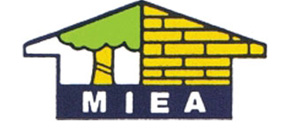
The Brick Wall
The wall of yellow bricks represent buildings.
The Tree
The Tree with green foliage and yellow trunk with the blue stripes symbolises agricultural properties.
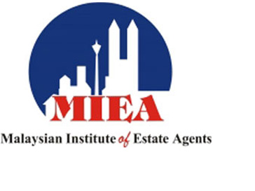
Background Design of Twin Towers, KL Tower, Commercial, Industrial & Residential Properties.
Reflects the progressive real estate industry in Malaysia and the different sectors of real estate that MIEA members are involved in.
Semi Circle Symbol
Indicated the Unity of mind and effort of the membership to lead the industry to greater heights.
Navy Blue Background
Portrays MIEA as an institute which upholds Professionalism, Integrity and Excellence.
The Red MIEA wordings
Depicts MIEA members as vibrant, energetic and forward looking to face the challenges of the new Millenium.
The Broad MIEA Letters
Denotes the strength of the Institute and a name you can trust.

Backdrop of Twin towers, KL tower
A reflection of the development of the property sector in Malaysia and that as members we need to keep pace with its progress.
Three blocks comprising of a commercial, industrial & residential building
It reflect the multitude of properties Estate Agents are engaged in selling.
An Arc shaped moon
It indicates unity of the membership and progressive Actions.
Navy Blue Colour
Portrays MIEA as an institute that upholds professionalism, integrity & Values.
The Red MIEA wordings
Shows vibrant, forward looking and enthusiastic membership.
MIEA name
Being at the base reflects the strong foundation and strength provided by the institute to the profession supported by the objects of the institute.
Yellow Box
The richness of the profession in helping the public acquire wealth.